Front Cover:
I attracted my audience by using a large, bold title that clearly stated the genre of my magazine, 'ROCK'. I did this so that it immediately attracts any interested fans of this genre and draws them in to wanting to read it.
Another way i addressed the audience is by using an image of the actors with an attitude as people in the rock industry
usually have a feisty attitude. Also, i have used models that are within the age range of my targeted audience, I done this by hoping that it again, attracts the audience so that more people buy the magazine.
The colour scheme i have kept to is teal, black and white. I used these colours as i feel dark colours associate best with the rock genre and draw in an audience. The black and white contrast each other well and makes the text stand out and the teal gives that extra colour so the magazine isn't completely dull being black white.
The headline is also large text spread across the screen followed by a smaller subheading to give the readers an insight to what the magazine contains about the featured band. I have purposely used the black text onto a green background so that it is clear and also using the white text onto the black so that the colours contrast making that text stand out successfully. Hopefully this will draw in an audience and interest them in the content of the magazine.
My magazine is targeted at both female and male and everything i have put into the magazine is to ensure that it is appealing to both genders. For example, because i have used a female band to feature on my magazine, i have used the dark colours to scrap any confusion for any possible male readers.
I have used sell lines to catch the eyes of any potential buyers of the magazine. Using the words 'Free', 'Special' and 'Plus' are good to draw in the interested viewers and make them feel they are getting value for their money. The price is also appropriate for my targeted audience at a price of £2.50.
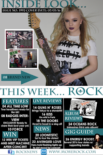
Contents Page:

I have kept the same colour scheme throughout my magazine so that it looks professional. I have also kept to an easy, clear layout so that there is no confusion when reading what page is which in the magazine.
Also i have included Facebook and Twitter pages because social media is a big part of this generation. This will allow my target audience to keep up to date and find out any extra information they want to know.
I have included competitions in my magazine to get the readers excited and wanting to win great prizes. It gives them a chance to win tickets to meet a band which would keep them buying any other issues of my ROCK magazine to see what other prises could be won.
I have included images of real rock stars and album covers to draw them further into the magazine. It will get them keen to view the content inside as my audience would be excited by going to gigs and exclusive dates.
My contents page is full of information which guides the audience and tells them what number the page is they want to view. This keeps nice organisation and is nice and simple for readers.
Double Page Spread:
I have used an eye catching title to draw the buyers into reading this interview if they are just scanning through. Having the featured bands name at the top of the page in large writing will attract any fans the band has and anybody else interested.
I have used the same actors throughout my magazine so that it shows consistency and backs up the image on the front cover and the information on contents page.
I have used buzz words such as 'exclusive' in an eye catching shape to attract the readers in even more. This will get them excited and read the rest of the story.
I have used the same colours on my double page spread as the same as the front cover and contents page. I have used the teal for the questions and white for the stories as the background is black, this makes my writing clear to read.
The colour scheme i have kept to is teal, black and white. I used these colours as i feel dark colours associate best with the rock genre and draw in an audience. The black and white contrast each other well and makes the text stand out and the teal gives that extra colour so the magazine isn't completely dull being black white.
The headline is also large text spread across the screen followed by a smaller subheading to give the readers an insight to what the magazine contains about the featured band. I have purposely used the black text onto a green background so that it is clear and also using the white text onto the black so that the colours contrast making that text stand out successfully. Hopefully this will draw in an audience and interest them in the content of the magazine.
My magazine is targeted at both female and male and everything i have put into the magazine is to ensure that it is appealing to both genders. For example, because i have used a female band to feature on my magazine, i have used the dark colours to scrap any confusion for any possible male readers.
I have used sell lines to catch the eyes of any potential buyers of the magazine. Using the words 'Free', 'Special' and 'Plus' are good to draw in the interested viewers and make them feel they are getting value for their money. The price is also appropriate for my targeted audience at a price of £2.50.
Contents Page:

I have kept the same colour scheme throughout my magazine so that it looks professional. I have also kept to an easy, clear layout so that there is no confusion when reading what page is which in the magazine.
Also i have included Facebook and Twitter pages because social media is a big part of this generation. This will allow my target audience to keep up to date and find out any extra information they want to know.
I have included competitions in my magazine to get the readers excited and wanting to win great prizes. It gives them a chance to win tickets to meet a band which would keep them buying any other issues of my ROCK magazine to see what other prises could be won.
I have included images of real rock stars and album covers to draw them further into the magazine. It will get them keen to view the content inside as my audience would be excited by going to gigs and exclusive dates.
My contents page is full of information which guides the audience and tells them what number the page is they want to view. This keeps nice organisation and is nice and simple for readers.
Double Page Spread:
I have used an eye catching title to draw the buyers into reading this interview if they are just scanning through. Having the featured bands name at the top of the page in large writing will attract any fans the band has and anybody else interested.
I have used the same actors throughout my magazine so that it shows consistency and backs up the image on the front cover and the information on contents page.
I have used buzz words such as 'exclusive' in an eye catching shape to attract the readers in even more. This will get them excited and read the rest of the story.
I have used the same colours on my double page spread as the same as the front cover and contents page. I have used the teal for the questions and white for the stories as the background is black, this makes my writing clear to read.


No comments:
Post a Comment