Saturday, 30 April 2016
Friday, 29 April 2016
Evaluation 7
Looking back at your preliminary task, what do you feel you have learnt in the progression from it to the full product?
I feel that i have learnt a great deal since my preliminary task and from the images below in comparison to them both it is clear to see.
I feel that i have learnt a great deal since my preliminary task and from the images below in comparison to them both it is clear to see.
Firstly, looking at the two mastheads of the magazines you can see on my preliminary task that it is fairly straight forward, bold text whereas on my music magazine cover i have challenged the conventions by placing it behind the head of the models, also using some blending options and changing font to match my genre. As the magazines are completely different genres they are also different styles. On my music magazine i have followed style models to try and make my magazine look as professional as possible, this included having a lot more content of the front cover to draw in the audience and catch peoples eye. However, on my prelim work it is plain, ordinary text and seems boring to look at.
Looking at the actors that model in the two magazines you can see the different attitudes they have. This was done purposely to suit the genre of the magazine. In my preliminary task the model seems joyful but has no connection with the reader and is closed off to the audience. As you can see in my music magazine it is the opposite and all three models have direct eye contact with the reader. This is to show their confident, feisty attitude which i wanted so that it matched the genre i chose and drawn in any rock fans that are interested in the magazine.
Overall, the two magazines are completely different and you can clearly see my progression from the preliminary task to the full product. My music magazine shows a lot more on the front page which is needed to draw in an audience and also it is clear that i have challenged a lot more conventions as the prelim work is very plain and boring.
I feel this also shows my progression as a media student and it has also taught me a great deal about many technologies and programs i was not familiar with before. Throughout this process i have developed many new techniques using cameras, editing and designing programs such as photoshop and in design which all contributed to my final piece.
Comparing these two contents pages you can see many differences. My music magazine contents page has a lot more going on and includes lots more information which would be beneficial to the reader if they wanted to skip to any pages. This is opposite to my prelim work as it is plain instructions and does not excite the reader or make them want to read on. I have learnt that using headings makes my magazine more organised and directs the readers to what they want to read. Using the Facebook and Twitter names at the bottom of music magazine allows the audience to find out any extra information they want to know and excites the audience whereas, on the other contents page it doesn't contain anything interesting. I feel looking at these two contents pages and comparing them that it really shows the progression i have made.
As a double page spread was not part of the prelim task, i was clueless on how to do one. Therefore, i built my knowledge by doing lots of research and like the front cover and contents pages, i followed the style models i viewed. Throughout the process of learning about a double page spread it has been difficult and challenging as i learnt more each day about the fonts and techniques used to get the correct layout.
Evaluation 6
What have you learnt about technologies from the process of constructing your product?
In the process of constructing my media product i have learnt how to operate many new technologies. This has helped me to get my magazine to the standard it is at and helped me make it look as professional as possible.
First of all i familiarised myself with a cannon camera which has many different, confusing settings i had to figure out to get my pictures up to a good standard. The more i used the camera, i learnt new camera techniques and also shot from different angles.
Using a Mac computer was different from what i am usually used to. I mostly worked at first on a computer or laptop which was windows oriented and it is very different in many ways than the Mac computer. For the whole time i have done media i have used a Mac computer which has made me familiar with different programs and the way that they navigate. I have learnt a lot about these computers over the year and it played a big part in helping construct my media product.

Before doing media i had no idea how to operate photoshop or in design and i had to practise different techniques within the programs to become familiar with them. I originally created my drafts of my front cover, contents page and double page spread on indesign so i could mess around with different ways to set them. After i decided on my final layout i imported it to photoshop. This helped me take backgrounds out of my images, use different shapes also using different blending options and inserting different texts and images to ensure my magazine looked professional.
In the process of constructing my media product i have learnt how to operate many new technologies. This has helped me to get my magazine to the standard it is at and helped me make it look as professional as possible.
First of all i familiarised myself with a cannon camera which has many different, confusing settings i had to figure out to get my pictures up to a good standard. The more i used the camera, i learnt new camera techniques and also shot from different angles.
Using a Mac computer was different from what i am usually used to. I mostly worked at first on a computer or laptop which was windows oriented and it is very different in many ways than the Mac computer. For the whole time i have done media i have used a Mac computer which has made me familiar with different programs and the way that they navigate. I have learnt a lot about these computers over the year and it played a big part in helping construct my media product.

Before doing media i had no idea how to operate photoshop or in design and i had to practise different techniques within the programs to become familiar with them. I originally created my drafts of my front cover, contents page and double page spread on indesign so i could mess around with different ways to set them. After i decided on my final layout i imported it to photoshop. This helped me take backgrounds out of my images, use different shapes also using different blending options and inserting different texts and images to ensure my magazine looked professional.
Thursday, 28 April 2016
Evaluation 5
How did you attract/address your audience?
Front Cover:
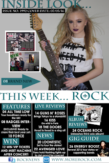
I attracted my audience by using a large, bold title that clearly stated the genre of my magazine, 'ROCK'. I did this so that it immediately attracts any interested fans of this genre and draws them in to wanting to read it.
Another way i addressed the audience is by using an image of the actors with an attitude as people in the rock industry
usually have a feisty attitude. Also, i have used models that are within the age range of my targeted audience, I done this by hoping that it again, attracts the audience so that more people buy the magazine.
The colour scheme i have kept to is teal, black and white. I used these colours as i feel dark colours associate best with the rock genre and draw in an audience. The black and white contrast each other well and makes the text stand out and the teal gives that extra colour so the magazine isn't completely dull being black white.
The headline is also large text spread across the screen followed by a smaller subheading to give the readers an insight to what the magazine contains about the featured band. I have purposely used the black text onto a green background so that it is clear and also using the white text onto the black so that the colours contrast making that text stand out successfully. Hopefully this will draw in an audience and interest them in the content of the magazine.
My magazine is targeted at both female and male and everything i have put into the magazine is to ensure that it is appealing to both genders. For example, because i have used a female band to feature on my magazine, i have used the dark colours to scrap any confusion for any possible male readers.
I have used sell lines to catch the eyes of any potential buyers of the magazine. Using the words 'Free', 'Special' and 'Plus' are good to draw in the interested viewers and make them feel they are getting value for their money. The price is also appropriate for my targeted audience at a price of £2.50.
Contents Page:
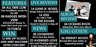
I have kept the same colour scheme throughout my magazine so that it looks professional. I have also kept to an easy, clear layout so that there is no confusion when reading what page is which in the magazine.
Also i have included Facebook and Twitter pages because social media is a big part of this generation. This will allow my target audience to keep up to date and find out any extra information they want to know.
I have included competitions in my magazine to get the readers excited and wanting to win great prizes. It gives them a chance to win tickets to meet a band which would keep them buying any other issues of my ROCK magazine to see what other prises could be won.
I have included images of real rock stars and album covers to draw them further into the magazine. It will get them keen to view the content inside as my audience would be excited by going to gigs and exclusive dates.
My contents page is full of information which guides the audience and tells them what number the page is they want to view. This keeps nice organisation and is nice and simple for readers.
Double Page Spread:
I have used an eye catching title to draw the buyers into reading this interview if they are just scanning through. Having the featured bands name at the top of the page in large writing will attract any fans the band has and anybody else interested.
I have used the same actors throughout my magazine so that it shows consistency and backs up the image on the front cover and the information on contents page.
I have used buzz words such as 'exclusive' in an eye catching shape to attract the readers in even more. This will get them excited and read the rest of the story.
I have used the same colours on my double page spread as the same as the front cover and contents page. I have used the teal for the questions and white for the stories as the background is black, this makes my writing clear to read.
The colour scheme i have kept to is teal, black and white. I used these colours as i feel dark colours associate best with the rock genre and draw in an audience. The black and white contrast each other well and makes the text stand out and the teal gives that extra colour so the magazine isn't completely dull being black white.
The headline is also large text spread across the screen followed by a smaller subheading to give the readers an insight to what the magazine contains about the featured band. I have purposely used the black text onto a green background so that it is clear and also using the white text onto the black so that the colours contrast making that text stand out successfully. Hopefully this will draw in an audience and interest them in the content of the magazine.
My magazine is targeted at both female and male and everything i have put into the magazine is to ensure that it is appealing to both genders. For example, because i have used a female band to feature on my magazine, i have used the dark colours to scrap any confusion for any possible male readers.
I have used sell lines to catch the eyes of any potential buyers of the magazine. Using the words 'Free', 'Special' and 'Plus' are good to draw in the interested viewers and make them feel they are getting value for their money. The price is also appropriate for my targeted audience at a price of £2.50.
Contents Page:

I have kept the same colour scheme throughout my magazine so that it looks professional. I have also kept to an easy, clear layout so that there is no confusion when reading what page is which in the magazine.
Also i have included Facebook and Twitter pages because social media is a big part of this generation. This will allow my target audience to keep up to date and find out any extra information they want to know.
I have included competitions in my magazine to get the readers excited and wanting to win great prizes. It gives them a chance to win tickets to meet a band which would keep them buying any other issues of my ROCK magazine to see what other prises could be won.
I have included images of real rock stars and album covers to draw them further into the magazine. It will get them keen to view the content inside as my audience would be excited by going to gigs and exclusive dates.
My contents page is full of information which guides the audience and tells them what number the page is they want to view. This keeps nice organisation and is nice and simple for readers.
Double Page Spread:
I have used an eye catching title to draw the buyers into reading this interview if they are just scanning through. Having the featured bands name at the top of the page in large writing will attract any fans the band has and anybody else interested.
I have used the same actors throughout my magazine so that it shows consistency and backs up the image on the front cover and the information on contents page.
I have used buzz words such as 'exclusive' in an eye catching shape to attract the readers in even more. This will get them excited and read the rest of the story.
I have used the same colours on my double page spread as the same as the front cover and contents page. I have used the teal for the questions and white for the stories as the background is black, this makes my writing clear to read.
Wednesday, 27 April 2016
Evaluation 4
Who would be the audience for your media magazine?
My audience for my music magazine is aimed at both male and female. Although the featured band on the front cover of my magazine features a trio girl band, it is still aimed to all rock music fans at the age of 13-19 and has a wide range of different bands within its content.
So the targeted audience is not confused, i have purposely used dark colours so that males that are interested in the magazine do not think its targeted towards just females. Colour plays a big part in identifying.
Another reason i used dull colours is because thats what rock is usually associated with; moodiness, aggression, darkness. I have purposely used this to draw in any rock fans that would be interested in the featured pictures and stories inside the magazine.

From the price of the magazine, i would say you could tell the age range of my magazine. It is at a price of £2.50 which is affordable for 13-19 year olds and isn't much considering the price of other magazines i came across whilst researching. I based the price on the research i done before starting the magazine and this was the lowest price i came across therefore, i feel i have made the right decision and this will help draw in the audience for my media magazine and ensure they are getting value for their money.
 As my audience would enjoy getting involved buying CDs and going to gigs their is competitions to win tickets and other gifts in the magazine. Also there are tour guides, dates and times so that they can keep up with whats going on in the rock industry. By doing this i hope that this would catch the eye of the audience and will make them excited to buy the magazine and enter the competitions.
Tuesday, 26 April 2016
Evaluation 3
What kind of media institution might distribute your media product and why?
 Bauer Media is an institution that would be beneficial if it distribute my media product because it is a large company with a wide range target audience. It has more than 600 magazines, over 400 digital products and 50 radio and TV stations around the world. I feel this would work well distributing my magazine as it already distributes Kerrang! magazine which i based my magazine on. However, if Bauer was to distribute my media product, because it also distributes Kerrang! it could become a problem as Kerrang! magazine is such a popular magazine and my magazine would fail when being in competition with it.
IPC Media is an institution i came across which didn't already have a specific rock magazine. However, there was a rock/indie magazine that they do publish but it is not majorly targeted to a rock audience. This would be positive for my magazine as there would be more time and room spent on improving my magazine as IPC range of magazines isn't as wide as other institutions such as Bauer Media.
As you can see NME, which is the rock/indie magazine they publish, has a rock kind of look to it as the actors show a feisty attitude and it has a discoloured look to it. My media product is very different to this therefore, i think IPC Media would be a good institution to publish my magazine. I think this because it doesn't have any products that would be in competition with my magazine, therefore buyers of IPC magazine will not have to chose between more than one rock magazine, this will attract more people to my magazine.
Sunday, 17 April 2016
Evaluation 2
How does your media product represent social groups?
My magazine targets male and females even though the main featured band for this particular magazine is females. Inside contains a wide range of rock bands which has a taste for every rock music fan.
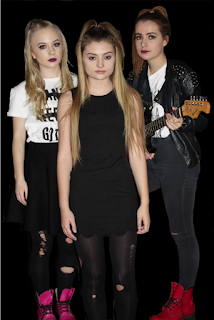
The models on the front cover are young, teenage girls around 17-18 which is between the age range that my magazine is targeting. This should draw in and catch the eye of the intended audience as the age rage i have chosen is 13-19. As my target audience is young, my price is aimed at middle/lower class people at a price of £2.50 which i think is affordable for students.
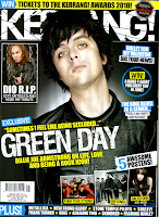
This image is the main image for my front cover and this includes three young girls who clearly have attitudes as no sign of emotion is showing. I purposely done this so that the models come across as 'moody' which is an emotion usually associated with rock and the 13-19 teenager age range. During my research looking at style models, the models used in the professional magazines photoshoots such as 'Kerrang!' always use unusual poses which influenced my decision to make this main image straight forward with the actors showing no facial expressions. Here are some examples of what i mean:


Friday, 1 April 2016
Evaluation Questions
1. In what ways does your media product use, develop or challenge forms and conventions of real media products?
2. How does your media product represent particular social groups?
3. What kind of media institution might distribute your media product and why?
4. Who would be the audience for your media product?
5. How did you attract/address your audience?
6. What have you learnt about technologies from the process of constructing this product?
7. Looking back at your preliminary task, what do you feel you have learnt in the progression from it to the full product?
Subscribe to:
Comments (Atom)


