 I have chosen a tagline for my main headline, it will be located underneath the headline providing the reader with more information about the featured band on the front page.
Monday, 29 February 2016
Tagline
 I have chosen a tagline for my main headline, it will be located underneath the headline providing the reader with more information about the featured band on the front page.
Thursday, 25 February 2016
Date and Barcode
The date and barcode is small and placed in the bottom right corner of the front cover so that it doesn't take any attention away from the main image, but it still allows the reader to see the date and price of the magazine to see how much it costs and how recently it has been published.
Price
The price of my magazine will be £2.50 as i feel this is a suitable amount of money for my targeted audience to pay for a magazine with good content inside including posters, information and other interesting things fans will love. It will be located next to the barcode and date of the magazine at the bottom right of the page.
Again my style models have influenced my decision as £2.50 is an average cost to pay for the magazines i have viewed.
Again my style models have influenced my decision as £2.50 is an average cost to pay for the magazines i have viewed.
Monday, 22 February 2016
Fonts
 I have chosen a font that goes well with the genre of my magazine. For most of the headings the font i have chosen is 'Charlemagne Std' which stands out and has a unique style to it.
Here is an example of a part of my front page which shows what type of style the font i have chosen is like.

For text that is not part of a heading, for example secondary text, i have chosen a font called 'Century Gothic'. I have chosen this font because i think it is clear and easy to read. The white writing on the image to the right is 'Century Gothic'
Sunday, 14 February 2016
House Style
For my house style i plan on using the colours, teal green, white and black. The dark fonts used are to represent my genre as rock is mostly associated with darkness, danger, aggressive behaviour which will attract my target audience. I used a main colour and then black and white to contrast eachother.
In my research, i came across mostly on style models for the genre rock, reds, dark greens, dark blues etc. so this influenced my final decision.
Main Headline
My main headline will be spread prominently across the cover in order to catch any fans of the featured band or my targeted audience, drawing them in to buy the magazine. It will be based on a darkish, green background and the headline will be black, bold font.
Friday, 12 February 2016
Masthead
My masthead will be large text at the top of the page to show clearly what my magazine is called. In this case mine is called "ROCK" stating clearly what my magazine is about and what genre it targets.
As you can see my title takes up a large part of the actual page, this is purposely to try and catch peoples eyes and draw them into the magazine and make them want to buy it.
Friday, 5 February 2016
Central Image
 I am using this image as my main front cover picture. I will take the background out of it and make it black so that other conventions will be incorporated well allowing room for secondary images and text to be clearly shown on the front cover.
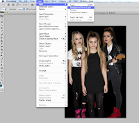
I have created a new layer from background, filled it in black and placed my image with the background took out, onto the other layer allowing me to now move onto adding titles and pictures.
Tuesday, 2 February 2016
Subscribe to:
Comments (Atom)


